The ETHBTC chart is often overlooked, but this “hidden” chart could be your best bet for finding volatility growth cycles. What makes this chart special is its ability to signal incoming volatility changes in the market.
The ETHBTC chart is often overlooked, but this “hidden” chart could be your best bet for finding volatility growth cycles. What makes this chart special is its ability to signal incoming volatility changes in the market.
When ETHBT goes up, it is usually a sign that money is flowing into the Ethereum network. This influx is not just idle money; is active, chasing returns, and often pouring into Ethereum DeFi, leveraged trading platforms, and meme coins. These sectors are known for their high-risk, high-reward nature, which naturally creates more volatility.
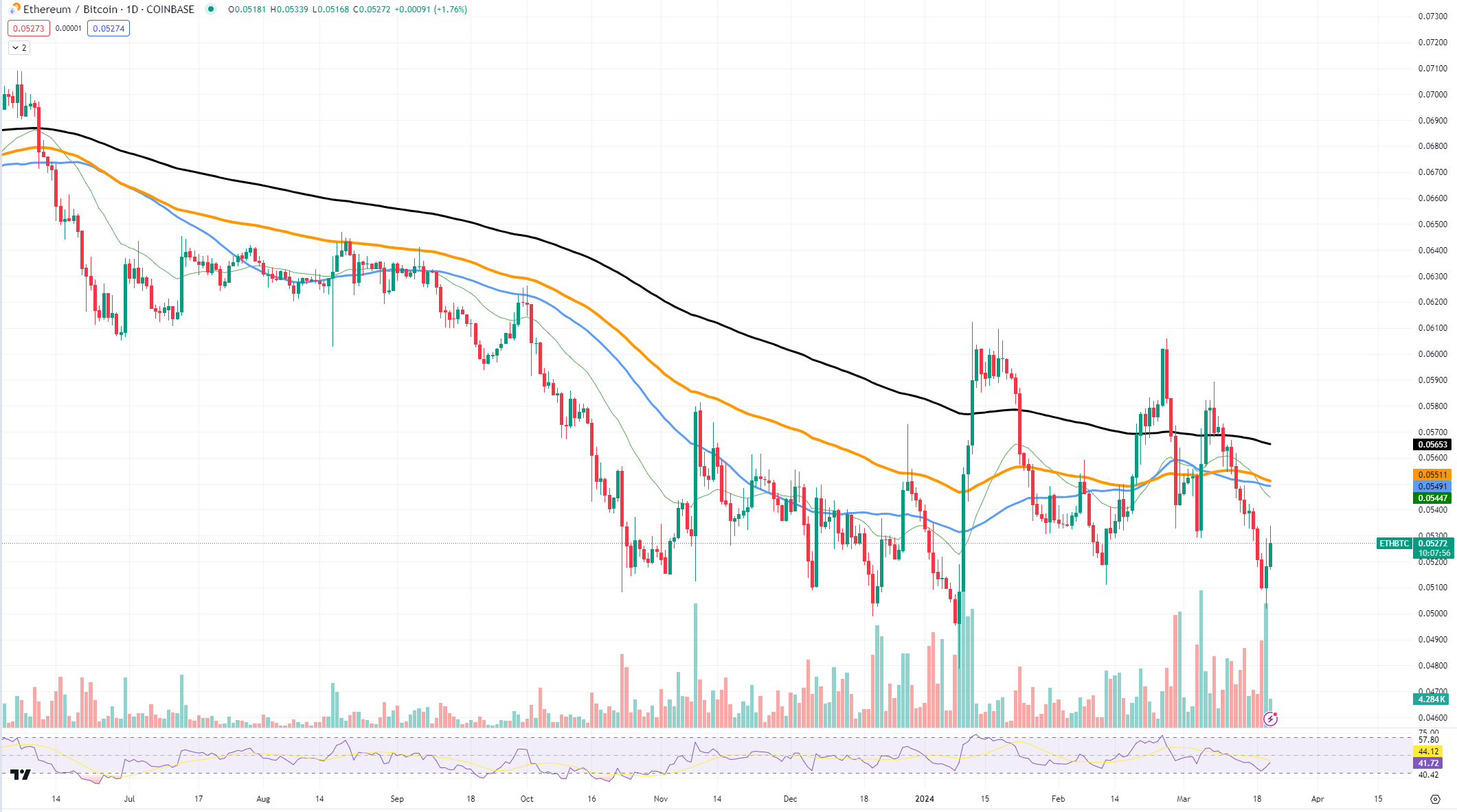
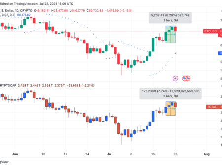
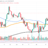
Looking at the chart, we see that the ETHBTC ratio has had its fair share of ups and downs. Recently, we can see a downward trend, indicating that Ethereum has lost some ground against Bitcoin.
Ethereum has a way of amplifying volatility when it receives more inflows than Bitcoin. A sudden rise in the ETHBTC index may be a prologue to a broader shift in the market, indicating that traders should prepare for an eventful trading period.
Similarly, the SOLBTC chart can be considered another indicator. Solana, with its own thriving DeFi and dApp ecosystem, can also influence market volatility.
On the current chart, there is a notable bounce from a recent low. This type of move often precedes increased trading activity on Ethereum as traders react to the relative price advantage. In the recent past, the ratio has been declining, but if the chart begins to curve upwards, it could mean that Ethereum, and by extension the cryptocurrency market, could be heading for a wild ride.